Themes
The Themes section gathers all the visual elements that define your site's identity: logo, favicon, color palette, typography and button shapes. The settings defined here automatically apply across your entire site (showcase pages, product pages, blog articles, emails and invoices) to ensure a consistent identity everywhere.
Come here when you set up your visual identity at launch, when you refresh your brand guidelines, when you want to try a preset theme to speed up your layout, or simply to adjust a specific color or font.
Your changes are saved in one go with Save at the top of the page, or discarded with Cancel.
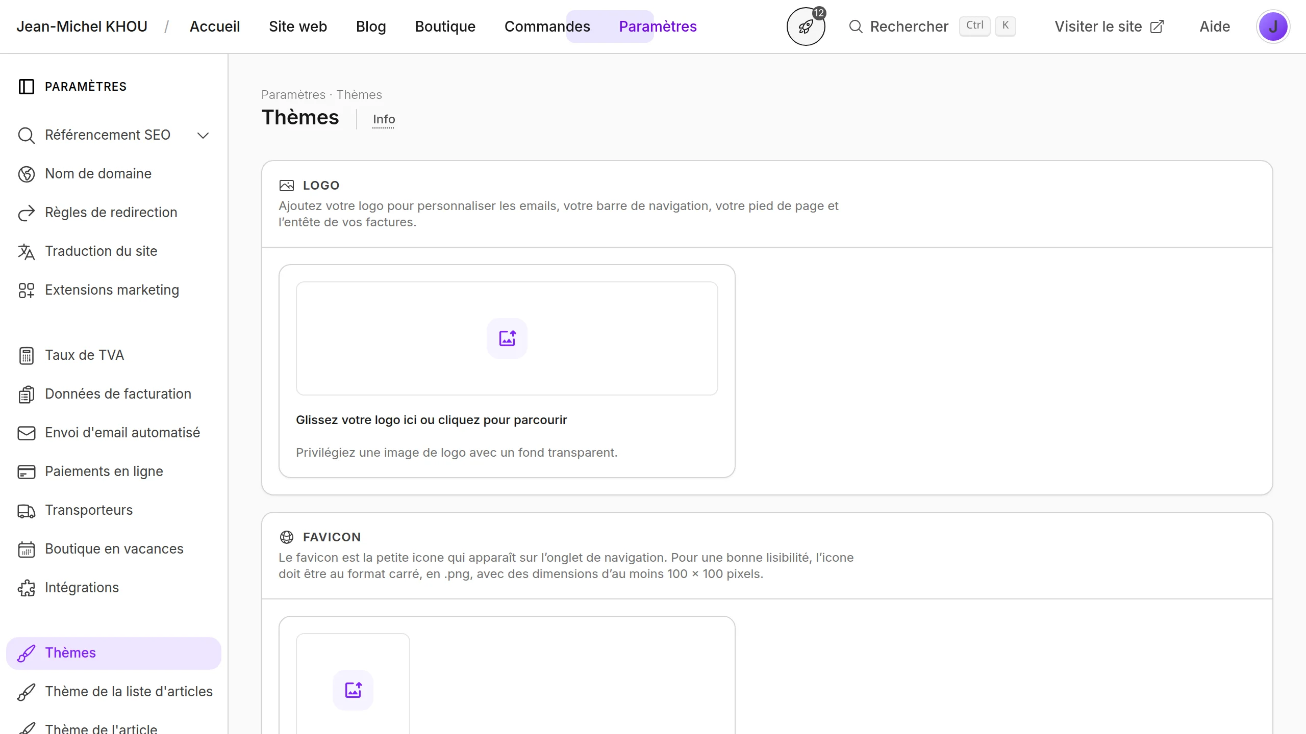
Logo
Your logo is used in the navigation bar, the footer, transactional emails and the header of your invoices. Setting it here avoids having to duplicate it in every module.
Upload your file in the dedicated frame. Prefer a vector or high-resolution file with a transparent background so it integrates cleanly on every surface.
Favicon
The favicon is the small icon shown in the browser tab next to the page title. It strengthens recognition of your brand when several tabs are open and also appears in the visitor's bookmarks.
Upload a square image in .png, with dimensions of at least 100 × 100 pixels for good legibility.
Site behavior
This section gathers the settings that change your site's general behavior on the visitor side.
Enable Disable right-click on your site to block the context menu on every page of your site. This protects your content (text, images) from quick copy-paste and download via right-click. When the option is active, a confirmation message appears in the section.
Preset theme
This section applies, in one click, a coherent set of fonts, colors and button shapes selected by our team. It's the fastest way to get a polished result without adjusting each setting individually.
Browse the available themes and click on the one that matches you: the typography, palette and button shape are automatically applied in the sections below. You can then customize each element to your taste.
Color palette
This section stores your brand's main colors. They are offered as shortcuts in every color picker of the visual editor, so you don't have to retype the hex codes every time you edit a page or article.
Click on a swatch to edit the color, or add a new color by clicking on the empty swatch. You can delete a color that's no longer needed via the corresponding icon.
Typography
Typography defines the fonts used by your site. A consistent font choice strengthens your identity and improves legibility.
For each element (Heading 1 font, Heading 2 font, Button font and Body font), click the matching button to open the font library. You can choose from the suggested fonts or import your own font file. A preview on the right shows your selection.
Shapes & colors
This section defines the default button shape and the accent color used everywhere on your site (call-to-action buttons, links, highlighted elements). Centralizing this choice ensures a consistent rendering from one page to the next.
Choose the Button shape from the list (Square, Slightly rounded or Fully rounded), then set the Accent color. Prefer a vivid or dark color that contrasts with white for good visibility. A Button example preview right next to it lets you check the result before saving.