

Shop theme
This page controls the appearance of the store page, that is the list of products your visitors see when they browse your catalog. Set the ready-made theme, the banner, the product grid, how images are displayed and the margins around the list here. The Preview on the right updates as you make changes. Switch between Desktop and Mobile to check both versions.
Come here when you launch your store and want to align its presentation with your visual identity, when you change predefined theme, or when you adjust the grid density to highlight a specific number of products.
The dashboard is shown in French, with English captions.
Read the video steps
- — In “Store theme”, open the theme selector.
- — Choose “Lou theme”.
- — Check the theme and its preview, then save.
- — Lou theme is saved for category pages.
Your changes are saved in one go with Save at the top of the page, or discarded with Cancel.
Category page
This section sets the foundations of the store theme: the ready-made template, the title and description shown at the top of the list, and the background and text colors applied to the whole page.
Pick a Theme to apply a coherent template (layout, ratios, spacing): besides the default theme, thirteen named themes are available (Lou, Bale, Minimal, Boutique, Magazine, Nordic, Luxury, Market, Urban, Atelier, Dense, Showcase and Carbon).
You can then refine each setting in the following sections. Fill in the Store name and the Category description (500 characters max, also used for the page's SEO) to introduce your catalog to your visitors.
Set the Background and the Text color to ensure a readable contrast.
Banner
The banner is the category image displayed full width at the top of the page.
Choose the Banner ratio among the available formats, from the 1:1 square to very elongated strips (up to 7:1). Enable Contain the banner to show the entire image without cropping.
Grid
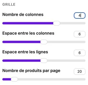
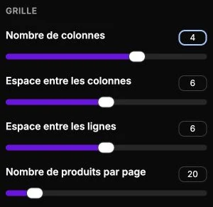
The grid defines how your products are laid out on the page. The right setting depends on the number of products, the format of their visuals and the density you want: a wide grid showcases each product, a tight grid gives the impression of a rich catalog.
Set the Number of columns to choose between 2, 3, 4 or 5 products per row. Adjust the Space between columns and the Space between rows to space out or tighten the grid. Set the Products per page (from 10 to 100) to control pagination, a high value spares visitors a click to the next page, but slows down the initial load.
Grid spacing
This section adjusts the inner margins around the product grid. They control the space between the page edges and the first product.
Use All sides to apply the same margin on all four sides in a single setting. Use Top, Right, Bottom and Left to adjust each side independently when you want a deliberate offset (for example more space at the top to breathe after a banner).
Product tile
This section drives how each product image is displayed in the list. A consistent visual presentation reinforces the credibility of your store.
Pick the Image ratio so that every thumbnail shares the same proportion. Enable Contain the image to show the entire visual without cropping (useful when your photos don't have a uniform framing). Enable Change the image on mouse hover to display the second product photo when the visitor hovers their mouse on it, giving an extra preview without clicking.
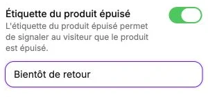
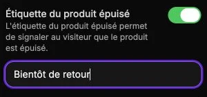
Enable the Sold out label to clearly mark unavailable products: enter the text shown on the thumbnail (for instance "Sold out").
Text spacing
This section adjusts the margins around the text on each product thumbnail (title, price). They control the space between the image and the information beside it.
Set Top, Right, Bottom and Left to give the labels more or less room depending on the density of your grid.