Positioning
The Positioning subsection aligns an element's content inside its block. It's available on most elements (Shape, text, button, images…) and decides where their content sits vertically when the block is taller than its content.
Direction
For Navigation and Social media, choose the Direction of the links or icons: Row places them side by side (the default); Column places them one below another.
The two alignment settings below follow this choice. Options such as Spaced distribute space from left to right in a row, or from top to bottom in a column.
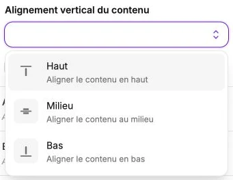
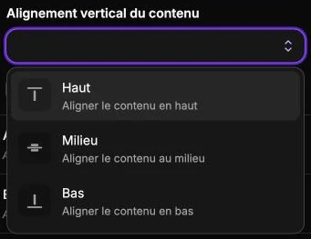
Vertical alignment of the content
Three options:
- Top: aligns the content at the top of the container (default value).
- Middle: aligns the content vertically in the middle.
- Bottom: aligns the content at the bottom.
It's notably useful for vertically centering a heading in a tall Shape, or anchoring an icon row at the bottom of a card.
Horizontal alignment of the content
Elements that lay out their content in a row (Navigation, social networks…) also offer a Horizontal content alignment setting:
- Left: aligns the content to the left.
- Center: aligns the content in the center.
- Right: aligns the content to the right.
- Spaced, Spaced (around), Spaced (evenly): distribute the items across the available width, with space between them, around them or of equal size. Spaced is the default value for these elements.
Reset
The Reset settings button clears the custom direction and alignments to revert to the element's default behavior.