

Visibility
The Visibility subsection lets you show or hide an element depending on the screen format: desktop, mobile, or both. Handy when you want to offer a different version of the same block depending on the device (for example a detailed visual on desktop and a simplified version on mobile) without duplicating the content.
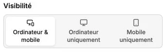
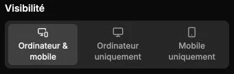
Choose where to show the element
Three options:
- Desktop & mobile: the element is visible on every format (default value).
- Desktop only: the element is hidden on mobile.
- Mobile only: the element is hidden on desktop.
The choice applies immediately and independently of the desktop/mobile editing mode selected at the top of the style panel. As soon as a format is hidden, a warning message reminds you of it in the subsection, and the summary shows Visible / Hidden for each format.
When an element is hidden on one format, its slot disappears entirely from the rendered page: neighboring blocks reflow to fill the space. Inside the editor too, the block no longer appears on the preview of the format where it's hidden: switch the desktop/mobile preview to find it and edit it again.
Typical use cases
Show a wide visual optimized for desktop and a cropped variant for mobile, display a different call-to-action depending on the device, or hide a decorative element on mobile that would weigh down reading on a small screen.
Going back to showing on every format
This subsection has no reset button: select Desktop & mobile again so the element becomes visible on every format.